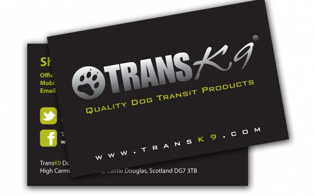
It’s one of the smallest marketing tools and more often than not it’s the first thing a prospective customer sees.
Be sure to think of the following when designing or re-designing them.
– Keep in brand with colours and type face.
– Make them stand out.
– Think about the shape and size (if within budget).
Contact details: personal choice according to how much information you want to give out and this applies to social media too (icons only) or link information. Just be aware of space and not making your business card too cluttered.
Single or Double Sided: tempting as it may be to only print single sided to reduce the overall print cost, I’d suggest using both sides. So if you’re at a networking event and your business card is in a pile, you can stand out more with a design on the reverse and even be a talking point when someone sees your business card.
Finish: Matt or gloss laminated, Spot UV, on a much thicker board or on specialist board depending on your overall brand style.
Quantity: I know it’s like asking how long is a piece of string but rather have at least a box at events so you’re not caught short if someone asks for one.


Recent Comments